- © 2026 Annapolis Home Magazine
- All Rights Reserved
Like a superior artist, architect, or landscaper, an accomplished interior designer has a distinct vision and style. Everyone talks about making their client happy—and that they should. But… the whole point in hiring a professional designer is to bring someone into your life who, with their training, experience, and sharp eye, can transform your living space into something highly aesthetic—something you would not have been able to realize on your own. The three interior designers presented in these pages show us how distinctive a style can be. When you look carefully at the different spatial arrangements, materials, textures, and colors that characterize each project, you realize that not one of these designers could have achieved the same effect that the other two achieved in their projects because each designer brings a vision of their own.
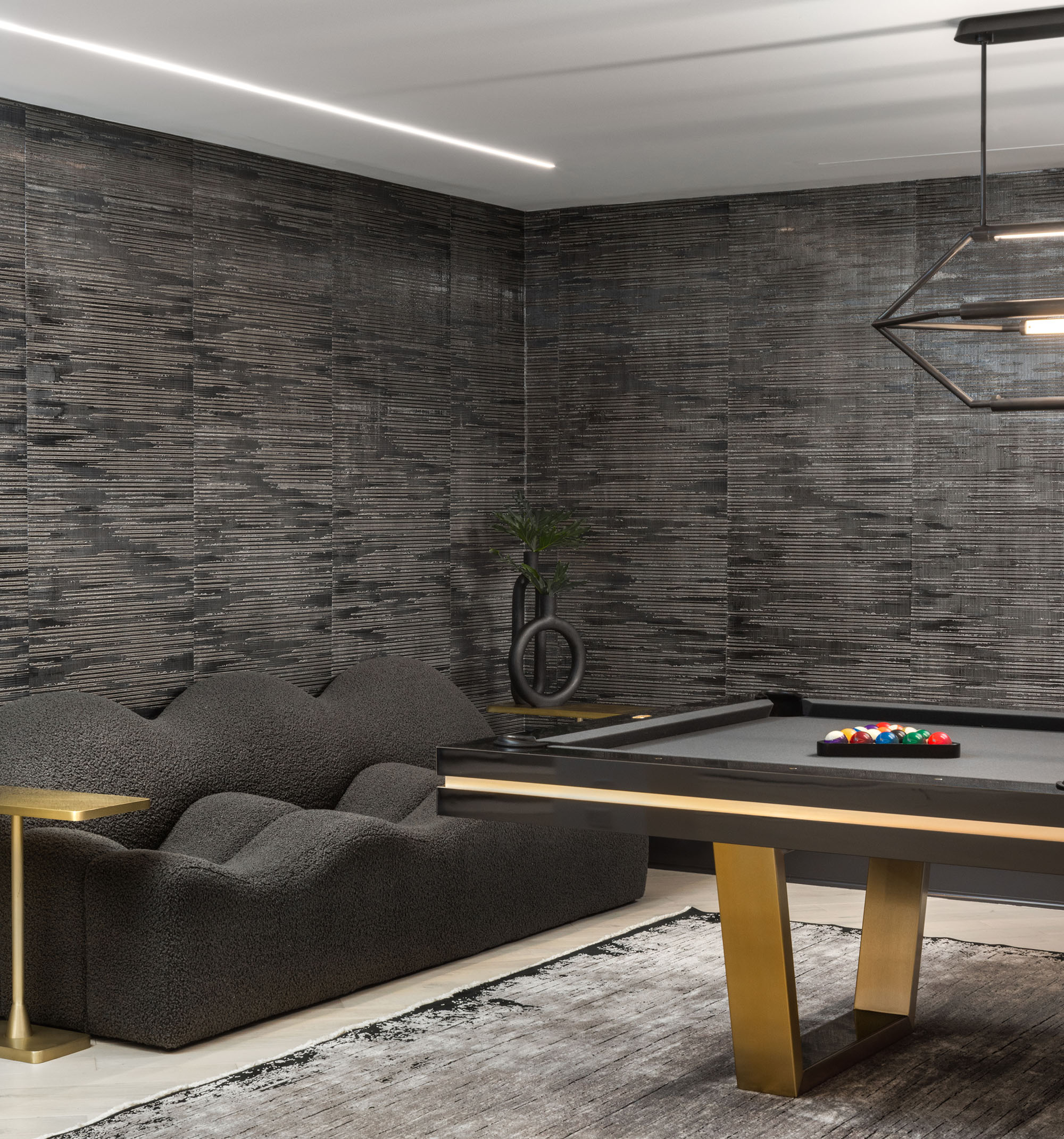
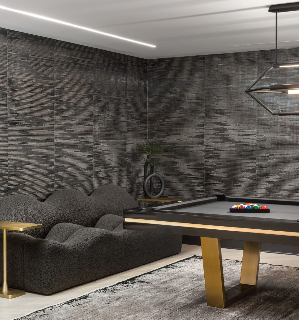
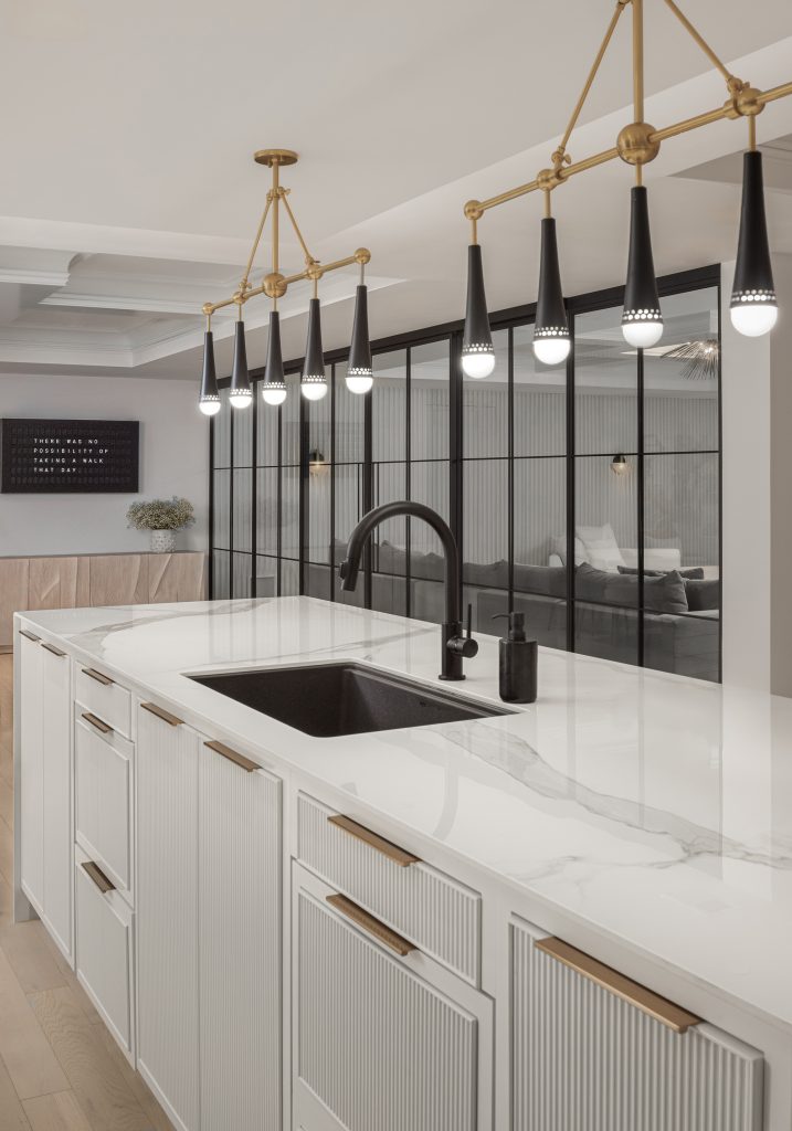
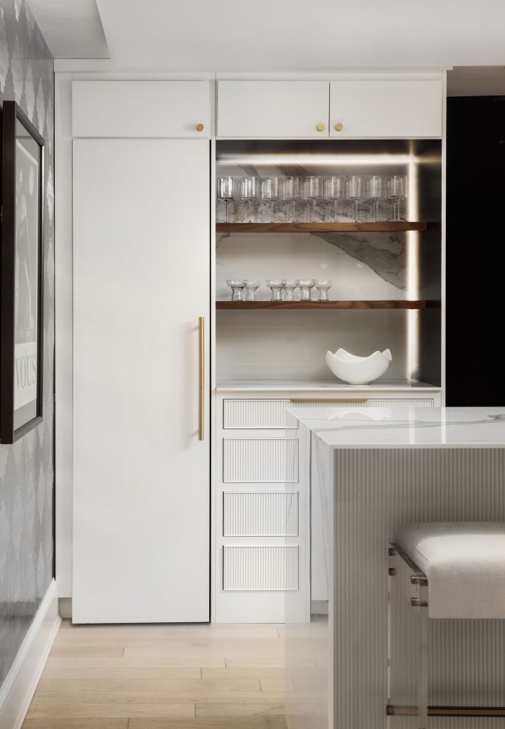
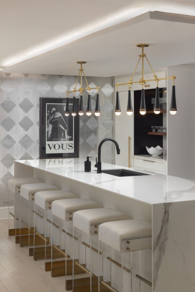
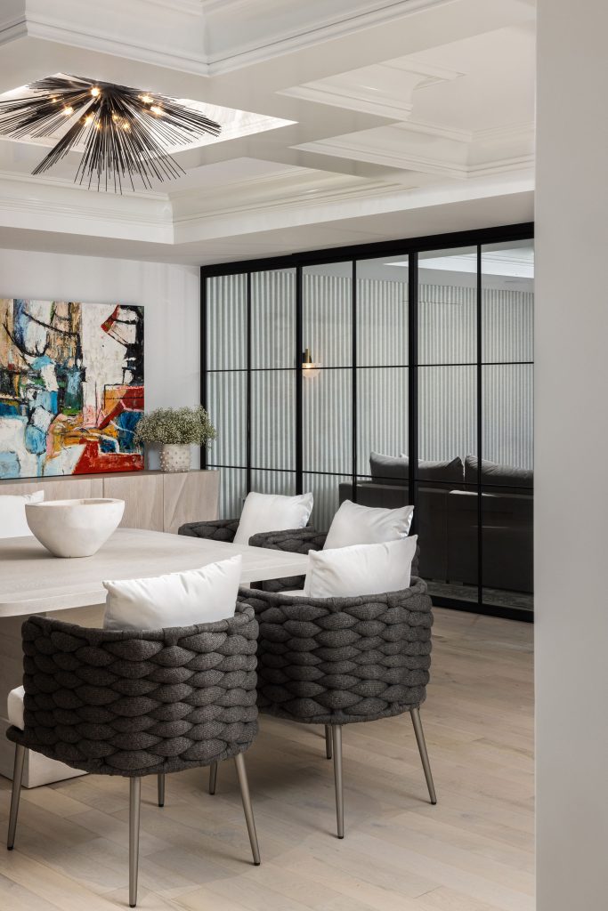
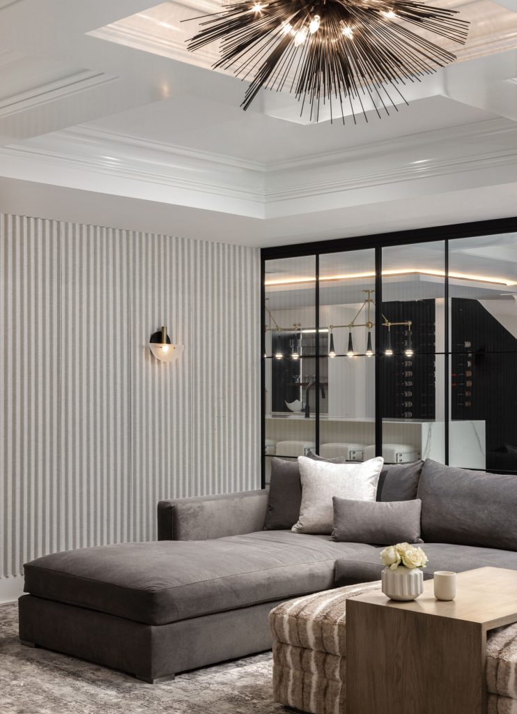
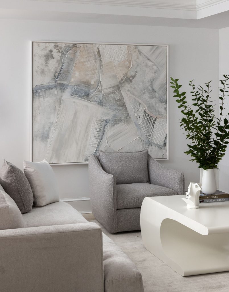
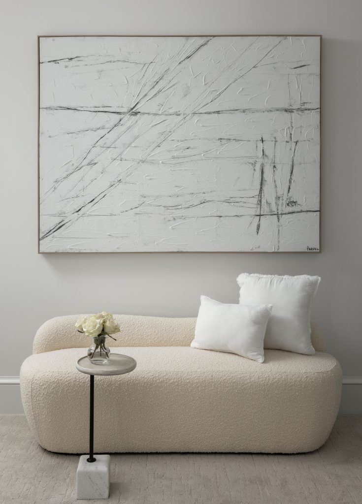
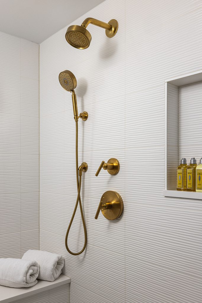
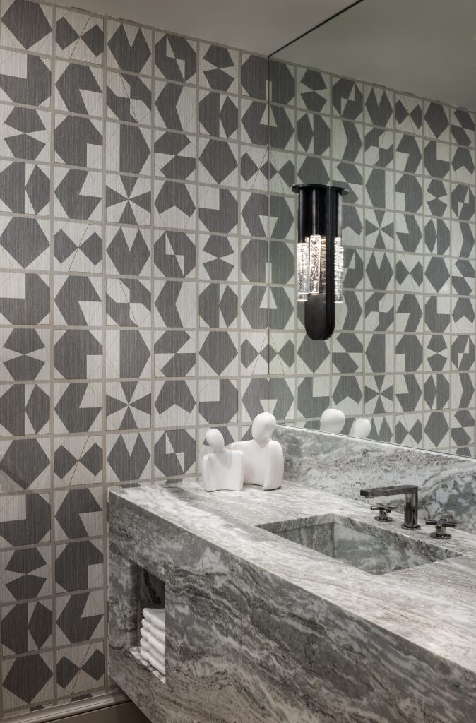
“Bold” isn’t a four-letter word for Katalin Farnady of Farnady Interiors, as evidenced in her recent design of an entertainment level for a home where high contrast and a well-conceived sense of balance achieve what she describes as “a sense of quiet drama.” Incorporating such spaces as a lounge, a game area, and a bar, the entertainment floor creates distinct sections where the owners can enjoy themselves at home or host guests for movie nights, billiards, or happy hour.
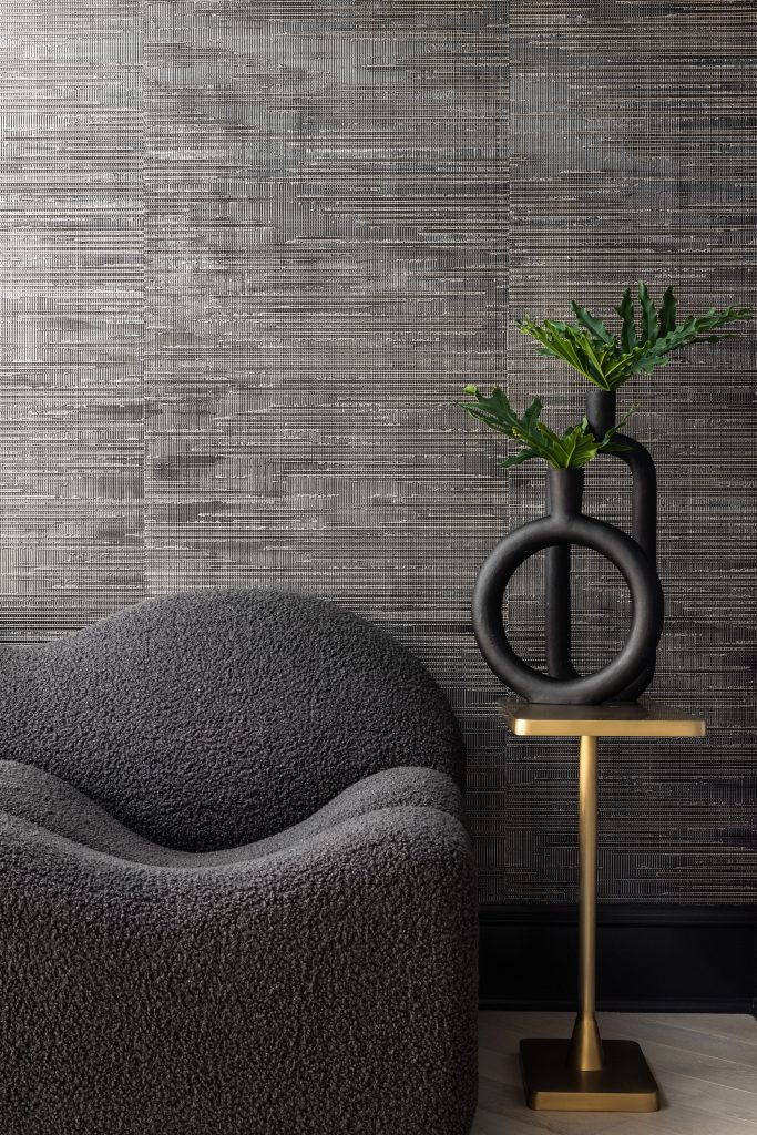
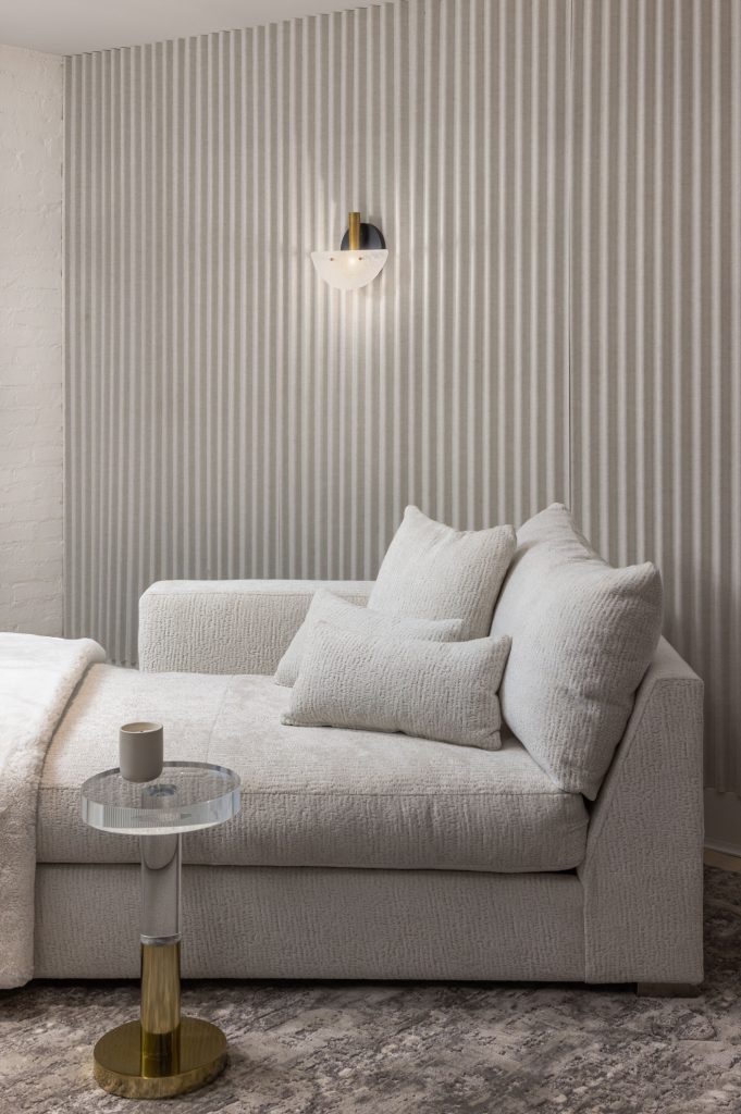
Clean shades of white, moody grays, and distinctive black work well to create that sense of drama Farnady envisioned. The space is one where a person could easily feel relaxed but not bored, thanks in large part to the big geometric patterns used throughout, along with the modern art and the statement light fixtures. Touches of gold stand out against the mostly monochromatic color palette, and the conscious use of texture in places like the carpet and the wallpaper lend interest to the room’s clean, sleek feel.
Every practical aspect of the room has its own character. This is particularly evident in the seating, where sofas, armchairs, and barstools each create a different vibe. Practically speaking, the diverse aspects of the room mean the owners and their guests could have a new experience every time, whether they are gathered around the bar for refreshments, kicking back on the sofa for a movie, or migrating somewhere in between.
What role does art play when you’re designing a space?
I use art to transform and finish the spaces. Art also helps bring personality to the design, adding richness and depth to any space. When you’re choosing art, you want it to be harmonious with its surroundings and to anchor the scheme. I’m a big advocate for local artists, so in every job I do, I’m trying to use work by a local artist if I can.
There are so many bold parts to this design—how do you balance all of them without making it seem too busy?
Establishing a sense of space, drawing the eye to a focal point, and enhancing architectural elements all play a crucial role in creating a mood. Every time you are going for bold, you must also know how to avoid doing too much. You can also play with the scale.
At some point, you know how to create the balance. Yes, it will be very punchy, and it will be very strong. But then again, if you keep everything else light, it balances out. It gives me a lot of pleasure when people aren’t afraid of bold and dark.
When you’re working with dark colors, such as the wallpaper and the sofa behind the pool table, is there ever a risk that it could feel heavy or gloomy? How do you avoid that?
I believe using dark colors will not make a space look smaller or gloomy but will create a sense of drama and contrast. When you’re designing with dark colors, the key is to keep a sense of balance that you can create with added textures and a mix of materials.
You should be less afraid to push boundaries. It doesn’t have to be loud and crazy. Make it not too busy. You also need to know how to take something away. Once you have everything laid out in the design process, you can step back and say, “Okay, if I really want something to stand out, I really have to make sure there’s nothing that’s going to draw the eye away from it.” You don’t need to be afraid of bold and dark—dark won’t make it sad or gloomy. You can use patterned wallpaper, and it won’t make it too busy if you keep everything else quiet.
These designs have a clean sleekness to them, but there are pops of texture throughout. How do you decide where texture is going to be the most effective? How do you decide which textures are most appropriate for a room?
This comes naturally—it’s my trained eyes, and I just feel it. It always depends on the spaces or items that are being used. For example, the 3D wall panels we used in the movie room are made of felt, and they are used to absorb the sound.
I like to tell a story with my design and whatever I put in. I like it to have a presence. It can be as simple as the stitching on the sofa or the wallpaper pattern. I don’t like boring.
Interior Design: Farnady Interiors, farnadyinteriors.com
Architect: Peter Miles, The Drawing Board, Inc., thedrawingboardinc.com
Appliances: ADU, adu.com
Stone & Tile: In Home Stone, inhomestone.com
Jenn Verrier Photography
Furnishings:
Cabinetry – Crystal
Flooring – Ultimate Flooring Design
Plumbing – Thos. Somerville Co.
Sitting Room Art – BB LaMartina
Wallpaper – Phillip Jefferies; Maya Romanoff; Kravet, Osborne & Little
3D Panels – CW Woodcraft
Lighting – Visual Comfort & Co.; Kuzco; Arteriors; Hudson Valley
Furniture – Bernhardt; Nomo; TOV; Vanguard
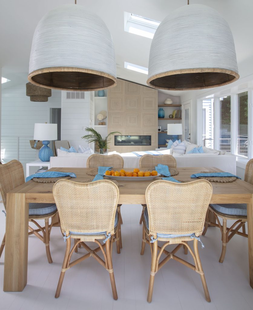
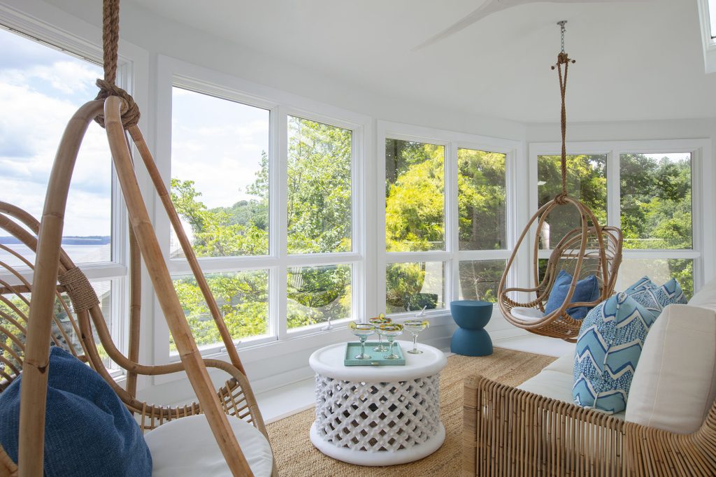
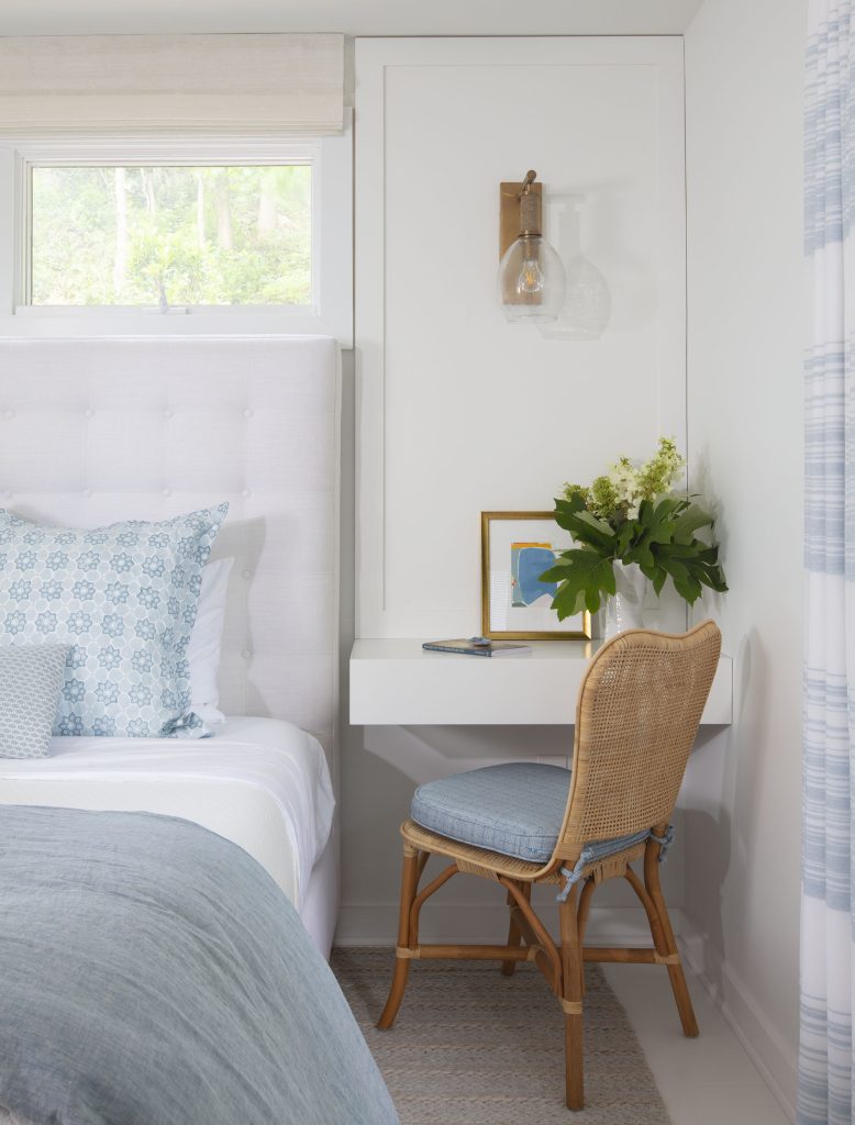
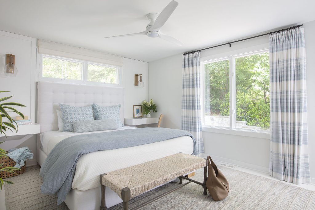
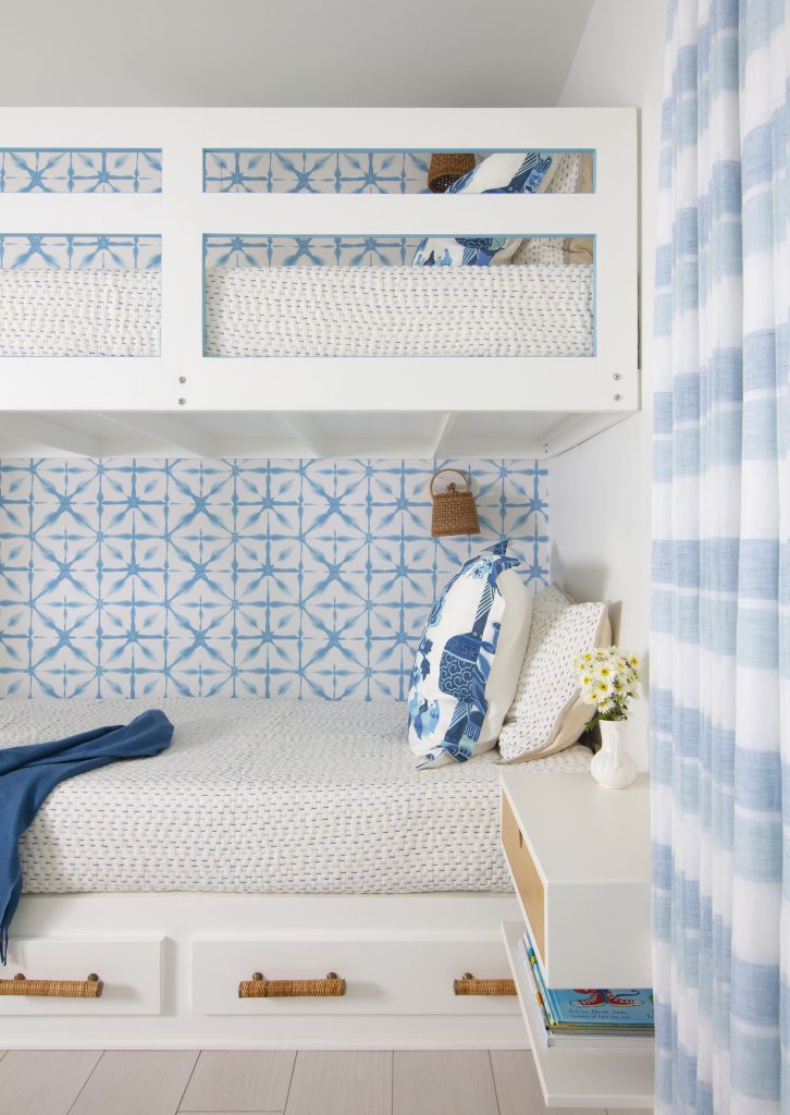
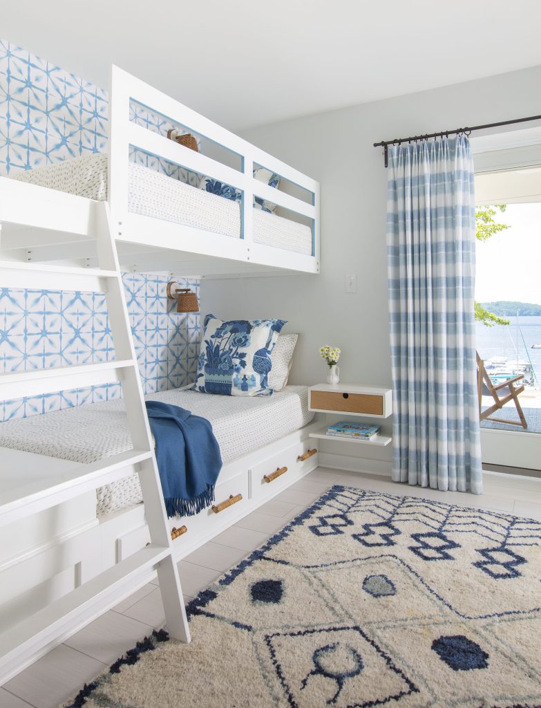
Before this home’s design even came to fruition, Erin Paige Pitts and her clients referred to it as “the hideaway.” The idea was to create a second home that could be a sanctuary and an escape from everyday life—something calm, something tranquil. The owners’ primary home on Capitol Hill in Washington, D.C., felt unsafe after the January 6 insurrection, and they wanted somewhere they could go to be at peace.
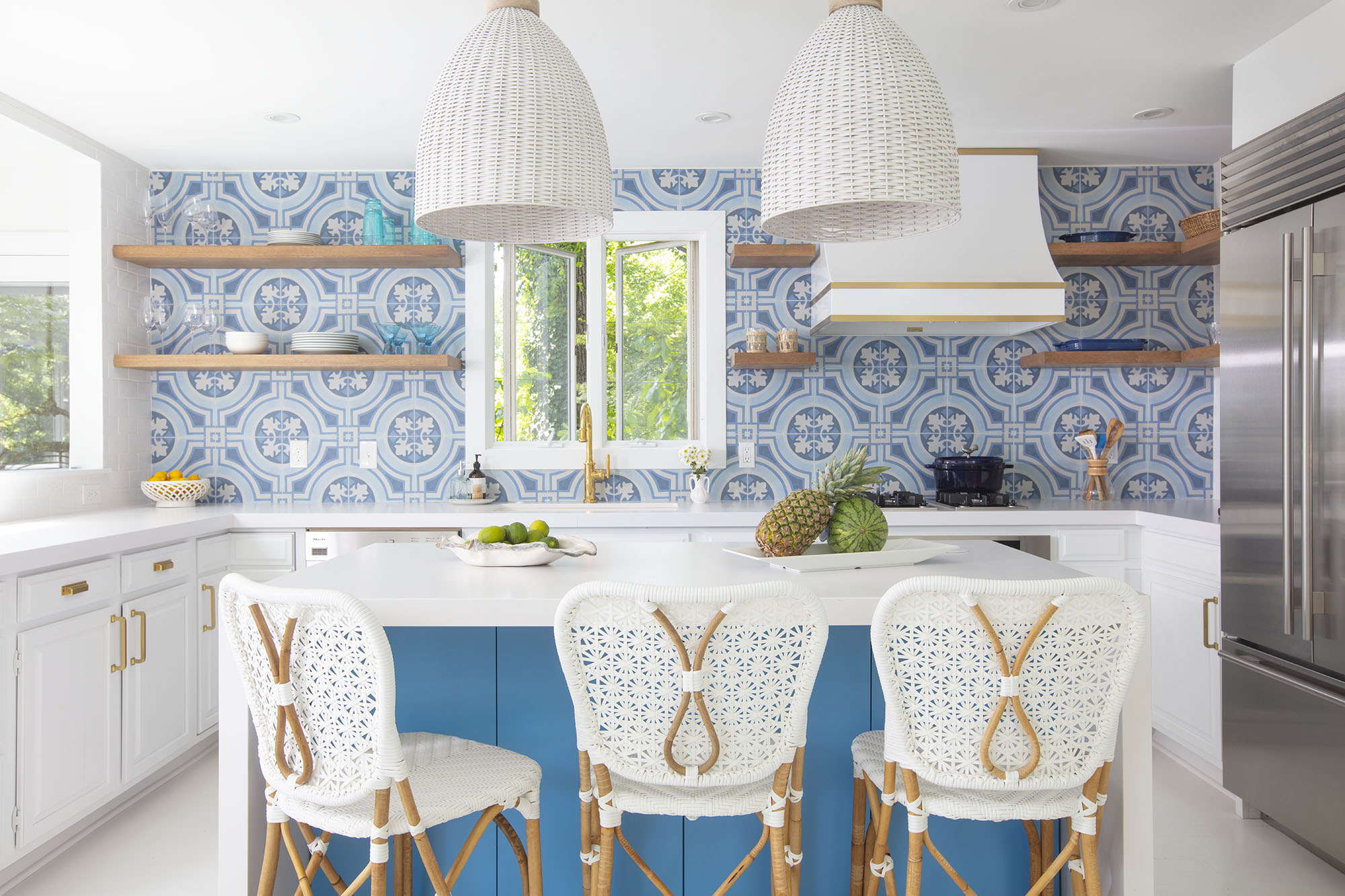
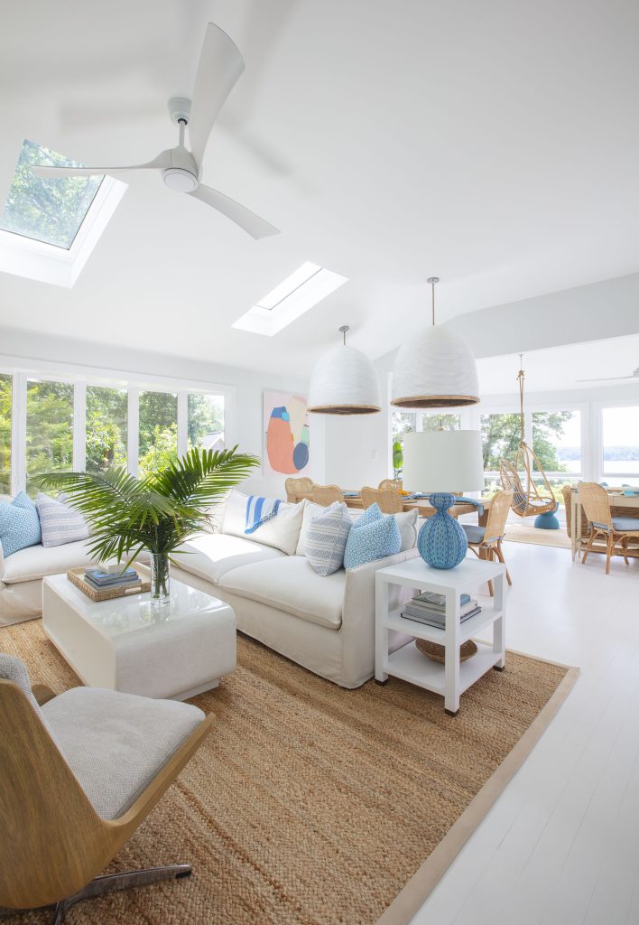
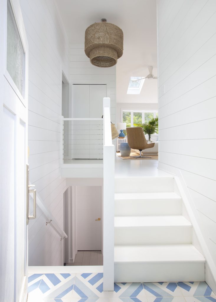
Paige set about creating a feel-good retreat. “This house was an escape from everything their normal life was,” she says. The clean white walls and flooring provide a perfect background for its relaxing color palette of coastal blues and greens and rustic wood textures.
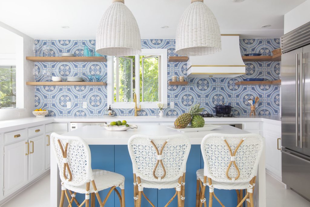
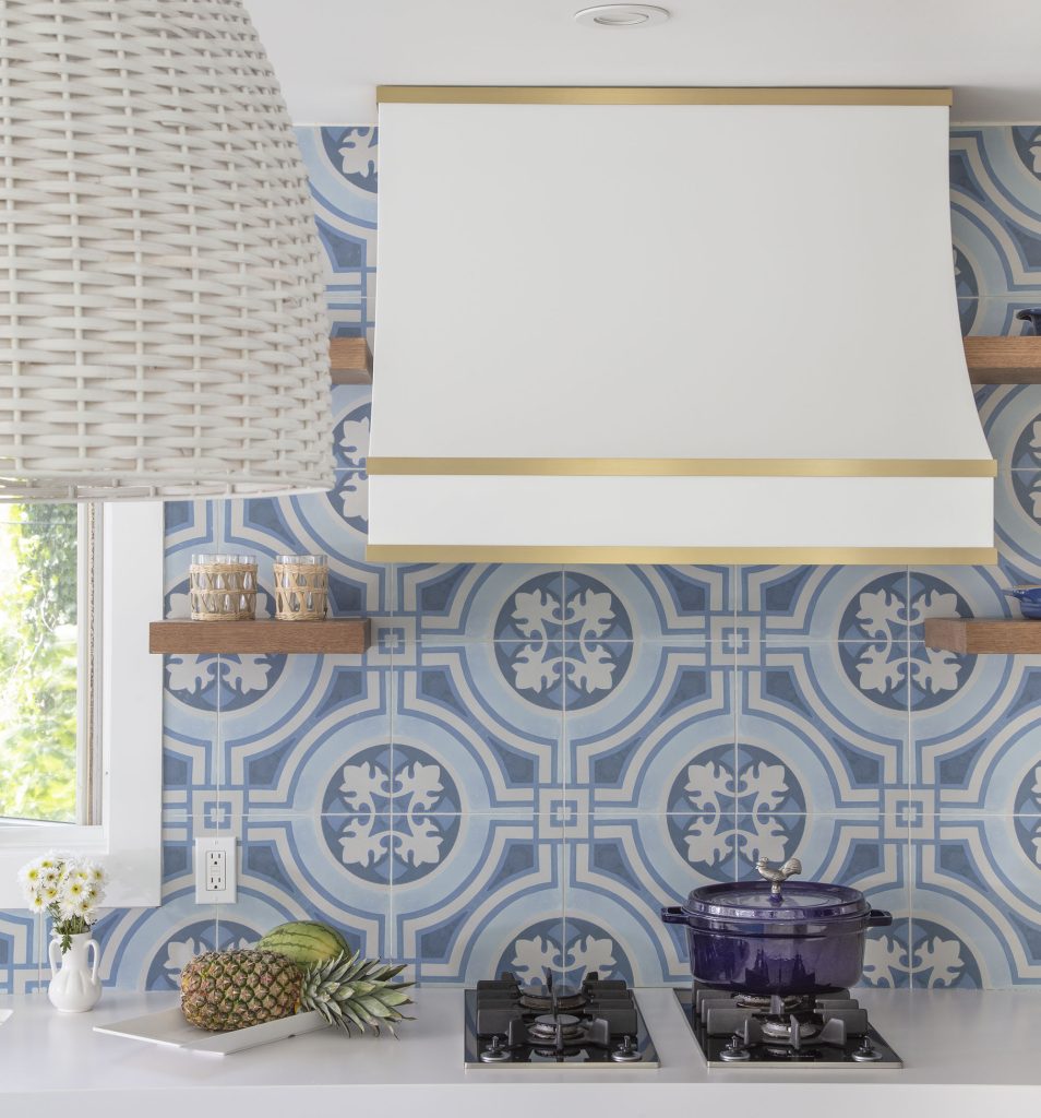
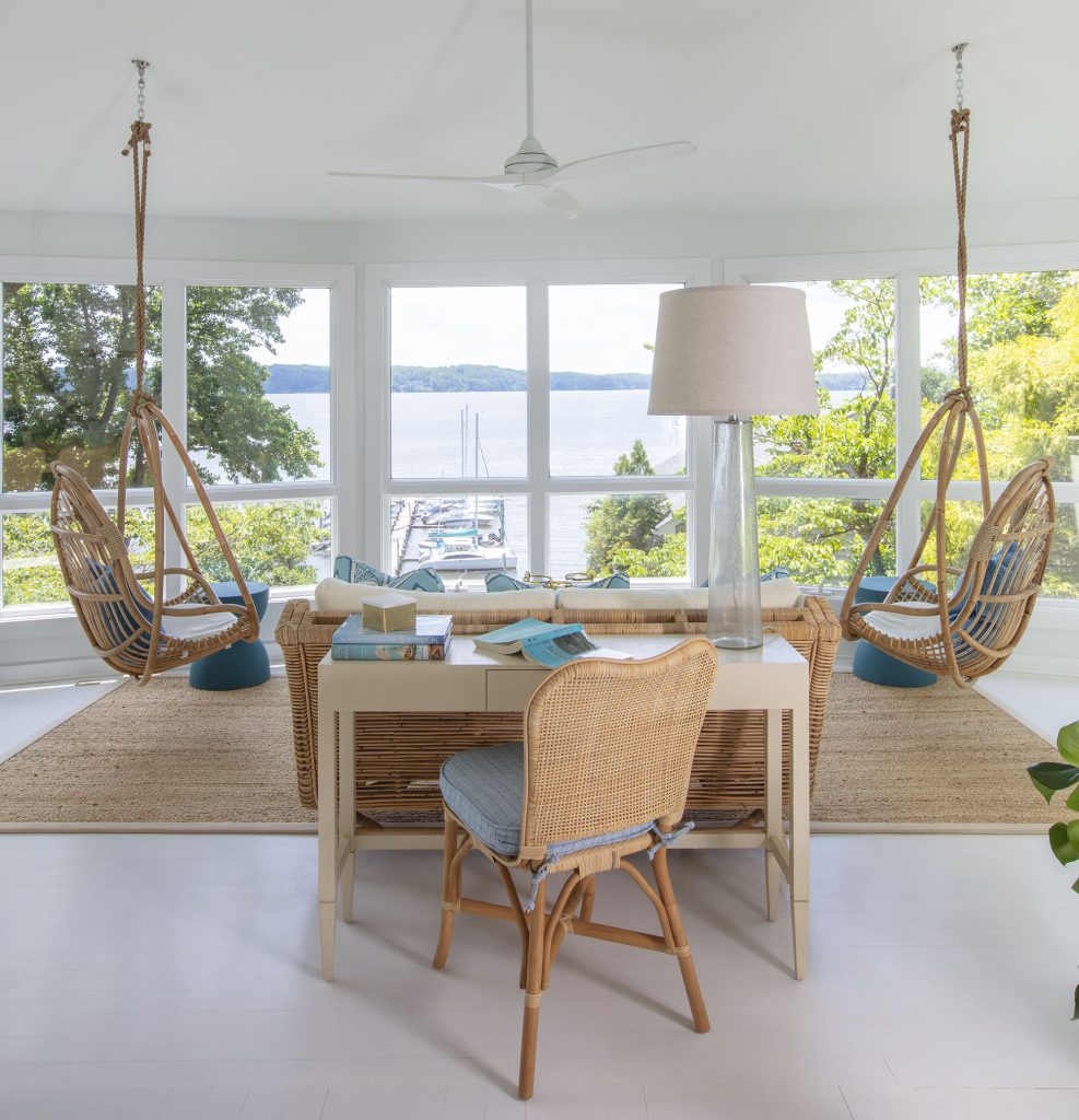
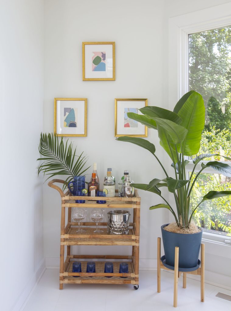
In the main living space, where expansive windows look over the water, woven rugs anchor distinctive areas for relaxation, including one with swings hung from the ceiling for an unusual seating option. The kitchen, boldly paneled in patterned tiles, looks crisp and sleek with its white counters and open shelving. The overall effect is elevated by touches of brushed gold on the hardware, including the trim of the range hood.
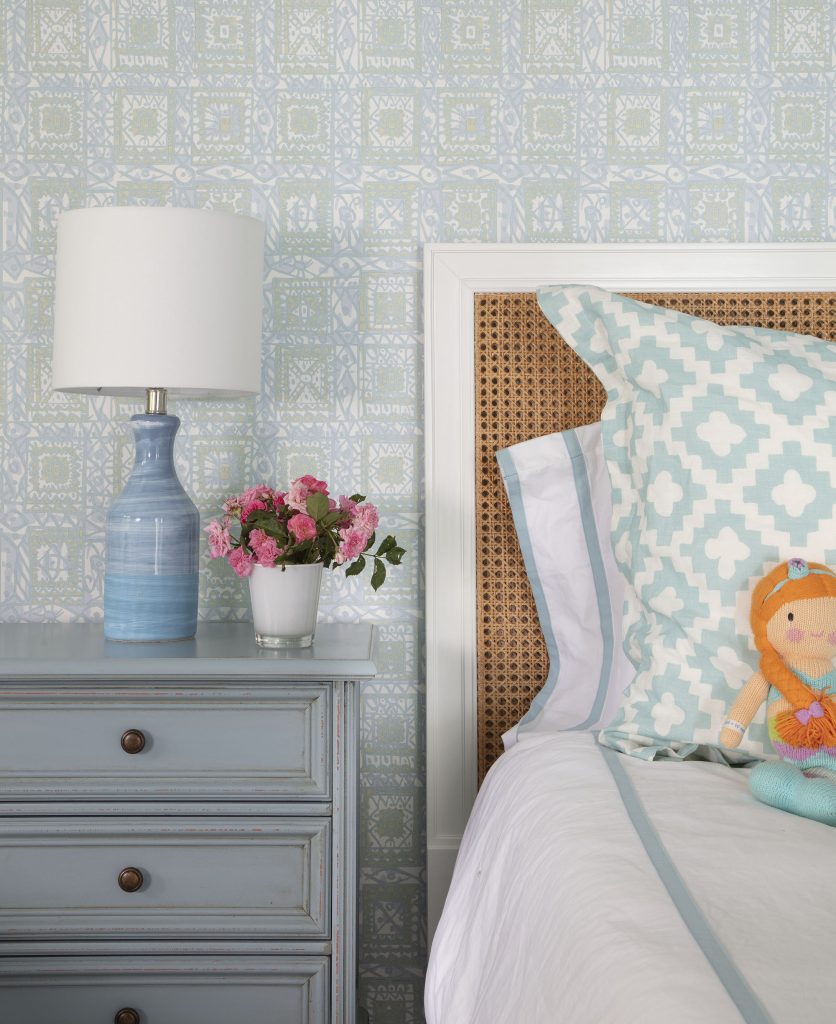
Light fixtures stand out with their wicker covers, which add to the relaxing beachy atmosphere. These colors and textures extend to the bedrooms, where wallpaper is used to create accent walls, and breezy curtains grace the windows. It feels, indeed, like a hideaway—fresh and clean and free of all the encumbrances of normal daily life.
How do you go about making a white room interesting?
I don’t see this house as all white. I see it as sort of clean and fresh. In good design, there are many layers to a well-designed space. So you’ll notice even though it has a lot of white walls and the white floor, it’s like a canvas for all the other colors. All the other colors pop more when they are on a backdrop such as that. Then we toned down the white with the use of a lot of natural materials. Whenever you put natural materials in any space, it gives it a lot of warmth and depth and character. So the white is kind of just a very clean, crisp, refreshing backdrop that allows all the layers to take center stage. Those layers are the colors and textures and different elements we added in.
How do you mix and match texture and color?
The truth of the matter is we start with a lot of elements, and then it is an editing process. We have a lot of things we like, and then we play with them and move them around and remove some of the things until the mix is balanced and feels really good. The best designs are those that have cross-relationships, and those cross-relationships are very subtle. But that’s what ties a lot of elements together, particularly in large spaces, without ever feeling matchy-matchy. So, these cross-relationships: We might bring in an element in one space, but we’ll tie it into an element in another adjacent space, one you can only see at a distance, but there’s still that distance and balance of color. You move and finesse and play with it until the balance is good.
What do you need to consider when creating a balanced room?
It’s different in an open-plan space: a house that has several contiguous spaces that are all open to one another in the main living area. In some respects, you treat it as one big space, but you don’t want it to be blank or uninteresting. That’s where balance comes into play. You might give a little bit more color in a certain area or dial a bit back a little. We have lots of things that we want to incorporate, whether it’s tile, a fabric, a floor covering, or furniture material. After you’ve been doing it for so long, you know when it’s right and when it’s not right.
We have a rule in our office: we work it to a point, but then we step back. And it’s usually when we step back from the project and take a break that the magic happens. Because your mind has a chance to figure out what is working and what isn’t working. It’s usually when we come back to the project that all of a sudden, our brain figures out what needs to go and what needs to come. During the break, you figure out what you couldn’t figure out when you were so overly focused on it.
What are some good reasons to forego cabinetry in the kitchen? When would be a time to avoid this design choice?
This is a second home, so it’s not meant to be full of clutter and all the things you have in your main house—it’s supposed to be light. It’s supposed to be a cold glass of lemonade on a very hot day. It’s meant to be refreshing. It’s bright and cheerful and a sanctuary from the things they were trying to escape.
The house has only what they need. It’s not minimalism—it just doesn’t bear the weight of normal life. It’s fun. It’s freeing. It’s fresh. That’s different from minimalism. I don’t think anyone would call me a minimalist in my design style, but I think they would always say I have a very clean approach.
What should you consider when choosing lighting?
I am known—and have been for a long time—for very strong statement lighting. I don’t look at light fixtures as a functional source of light. I look at them as a functional source of light that can also bring an enormous amount of design, texture, and interest to space.
Sometimes, they’re really big. Actually, some of the fixtures in this project are really, really big. The two over the dining table are enormous, but it is also what helps create intimacy within a large space that has a high ceiling and a lot of windows. It’s very bright. Those types of fixtures make spaces far more intimate, even when they are big spaces. That’s very consistent in my work: whether it’s a polished nickel chandelier or a basket chandelier, they’re generally quite large, and they’re usually a statement. So, they’re giving you more than just a light source. They’re giving you a design element that is almost a focal point.
Interior Designer: Erin Paige Pitts Interiors, erinpaigepitts.com
Contractor: Karl Wentz, Kitchen & Bath Outfitters
Appliances: Ferguson, ferguson.com
Geoffrey Hodgdon Photography
Furnishings:
Living Room Sectional – Lee Industries
Coffee Table – Mr. and Mrs. Howard for Sherrill Furniture
Wood-Backed Chair – Four Hands
Lamps – Visual Comfort & Co.
Dining Table – Four Hands
Dining Chairs – Made Goods
Dining Room Pendants – Jeffan
Art – Leslie Thornton
Kitchen Barstools – Selamat Designs
Kitchen Backsplash Tile – Ann Sacks
Kitchen Pendants – Napa
Sunroom Console/Desk – Made Goods
Sunroom Wicker Settee – Selamat
Hanging Chairs – Selamat
Bunkbeds – Custom by designer
Bunk Room Rug – Jaipur Living
Bunk Room Wall Covering – Schumacher
Bunk Room Wall Sconces – Palecek
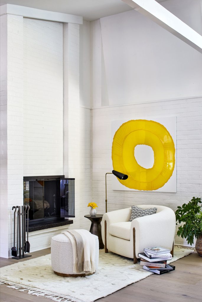
This design sprang from unfortunate necessity after the owners’ long-time home was lost in a housefire. As a builder worked to construct the home anew, expanding on the existing footprint by adding more square footage in the process, the owners enlisted Stephanie Bradshaw to design a new aesthetic for their freshly built home. Their vision was to pare down the large collection of knickknacks and décor they’d acquired over the years and focus on a more refined look instead.
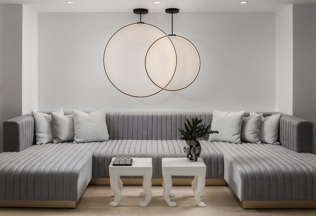
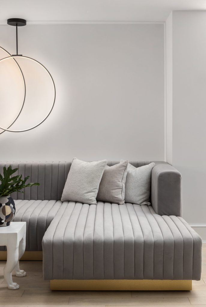
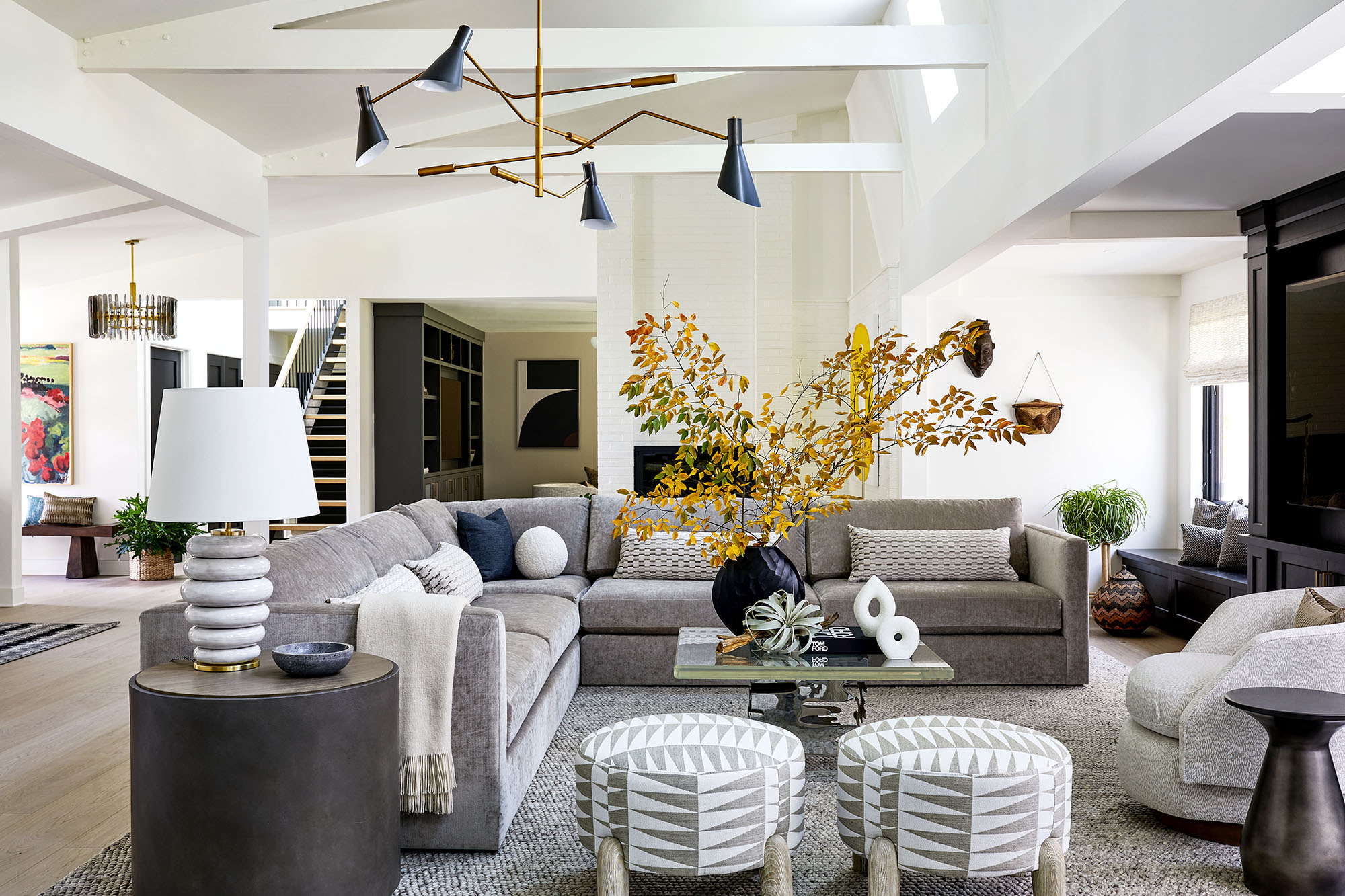
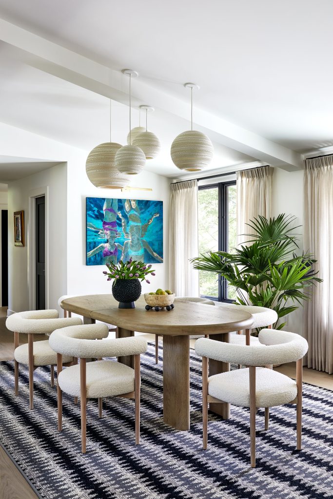
Drawing on the mid-century aesthetic of the original home, this design uses color and texture to create an atmosphere that’s sophisticated while still being fun and inviting: a place where two busy professionals can feel at ease but still show visitors a good time. Throughout the home, layers of neutral colors—specifically, shades of gray—are punctuated with bright pops of vibrant hues, including deep blue, bright yellow, and rich red. Further interest is added using items with striking patterns, as seen in the throw pillows, the upholstery, and the carpets that anchor different sections of the open-concept main living space. Artwork makes a statement in nearly every room, and the prominent use of green plants brings undeniable life to the environment.
This is a design that features a lot of artwork. Are there rules or guidelines for incorporating artwork into a home design?
We curated probably 50% of the artwork that was in this house. I think one of the reasons people enlist our help is because we do have a focus on artwork curation, and we place a lot of emphasis on helping homeowners find the right piece of art for the right spot. It’s such a personal decision. So, if homeowners come to us with existing art from their travels or something that they’ve loved for a long time, we’re more than happy to work around that, but we end up curating a good portion of the artwork that is in our projects.
What’s the best way to make a modern design feel warm and inviting?
I think a lot of that has to do with the colors and the textures that you bring in. It’s important to start with a good floor plan, and then you can layer the space with those textures and colors that really help create the vibe. The other thing that brightens up a space is the addition of plants; the greenery brings your eye to a certain space.
This design makes prominent use of grays and other neutrals. What do you need to keep in mind when you’re working with a lot of gray?
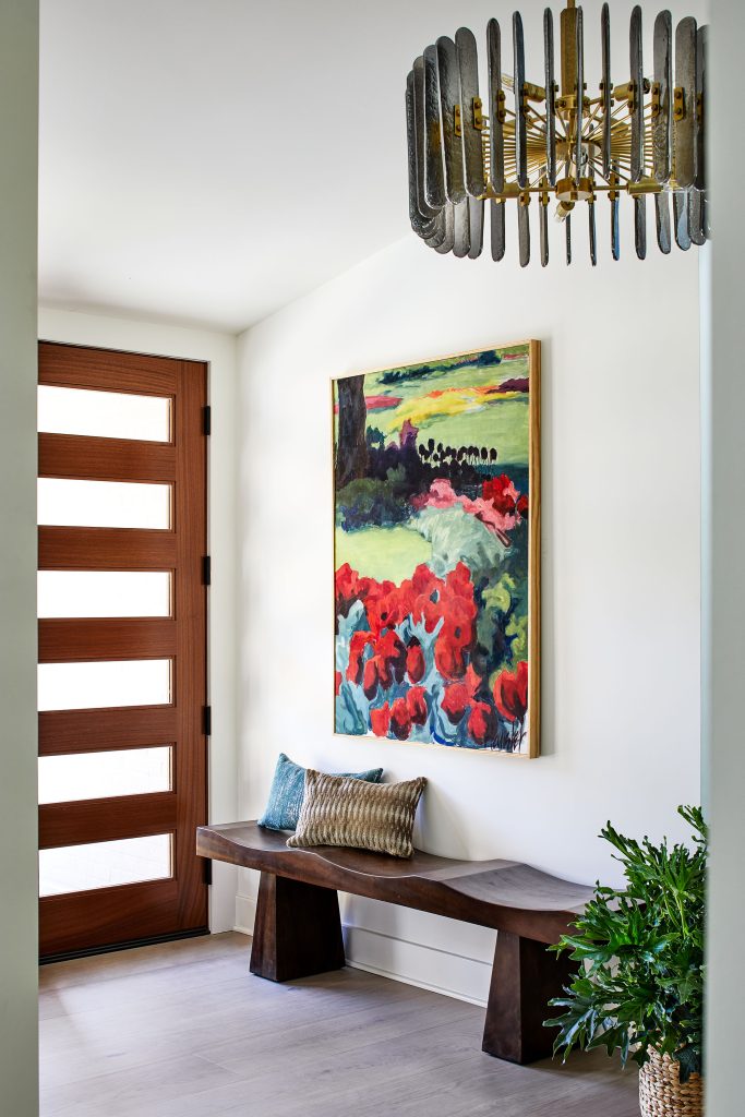
We used a lot of grays and neutrals, and often people think that goes kind of cold. But we did it in a way that is warm with the undertones and the texture. Then you can add in prints and patterns—large scale, medium scale, small scale—to give you a balance throughout the space. You can choose prints that are modern but still choose textures that give you the warmth you’re looking for. In the great room, you can see the rug is designed for a larger loom—it’s kind of nubby. Then there’s the geometric pattern on the ottomans. While the room feels neutral in the base layer, that brings the color more forward, such as the red poppies in the artwork in the foyer. There are a lot of different finishes of wood throughout the house and a lot of texture in the window treatments as well.
What kind of personality can a statement light fixture or lighting piece bring to a room?
The light fixtures are really like the jewelry of the space. Lighting is so imperative to the design, and it really sets the tone for the aesthetic. We did try to choose things that were interesting and provided different elevations of light and different rhythms throughout the house but kept everything really modern.

Interior Designer: Stephanie Bradshaw, stephanie-bradshaw.com
Builder: Batton and Son, battonandson.com
Stacy Zarin Goldberg Photography
Foyer:
Bench – Noir
Light Fixture – Arteriors
Art – Heuisler
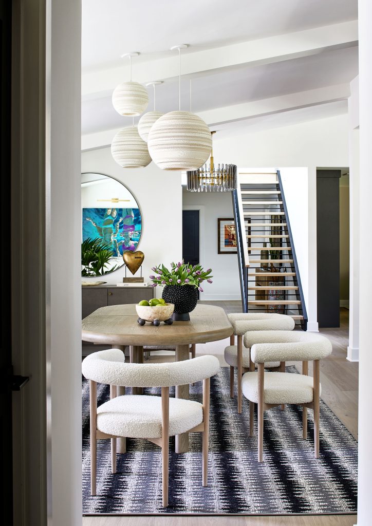
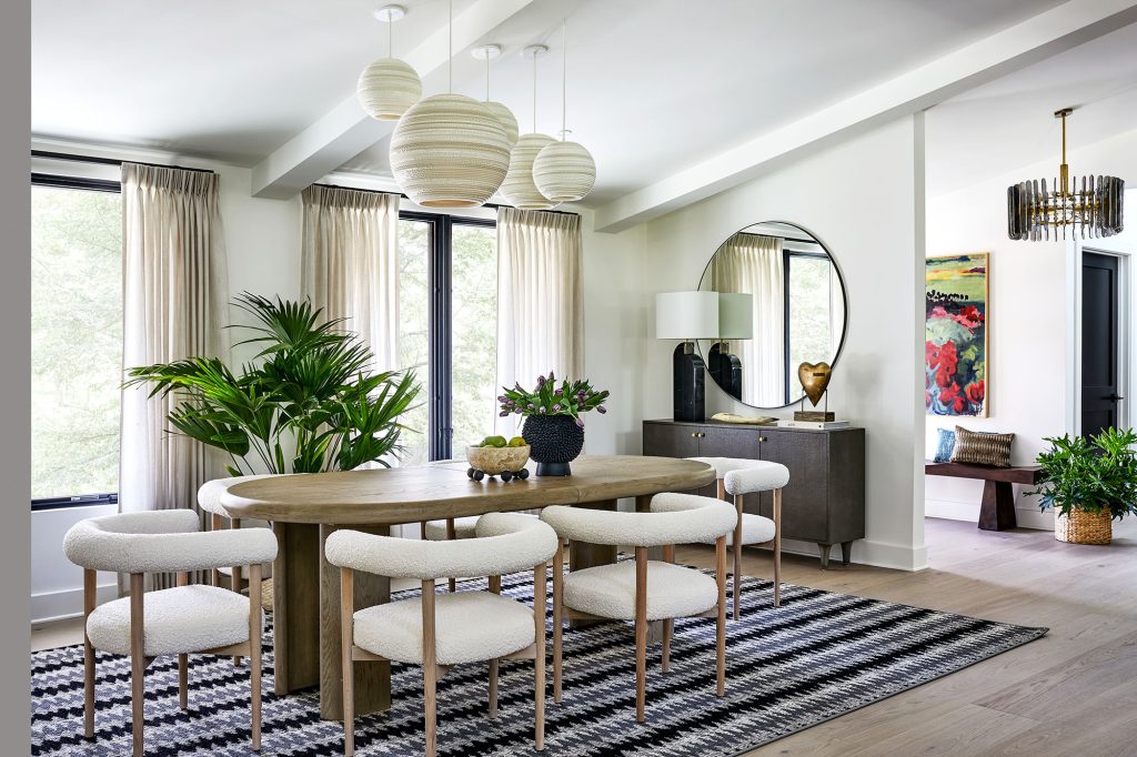
Dining Room:
Rug – Stark
Dining Table – Crate & Barrel
Chairs – Crate & Barrel
Buffet Table – Made Goods
Lamp – Visual Comfort & Co.
Mirror – CB2
Light Fixture – Graypants
Window Treatment – Grand York; Fabric: Romo
Artist – Michelle Poirer-Mozzone, Sorelle Gallery
Fireplace Sitting Area:
Art – Ted Collier, Oliver Cole Gallery
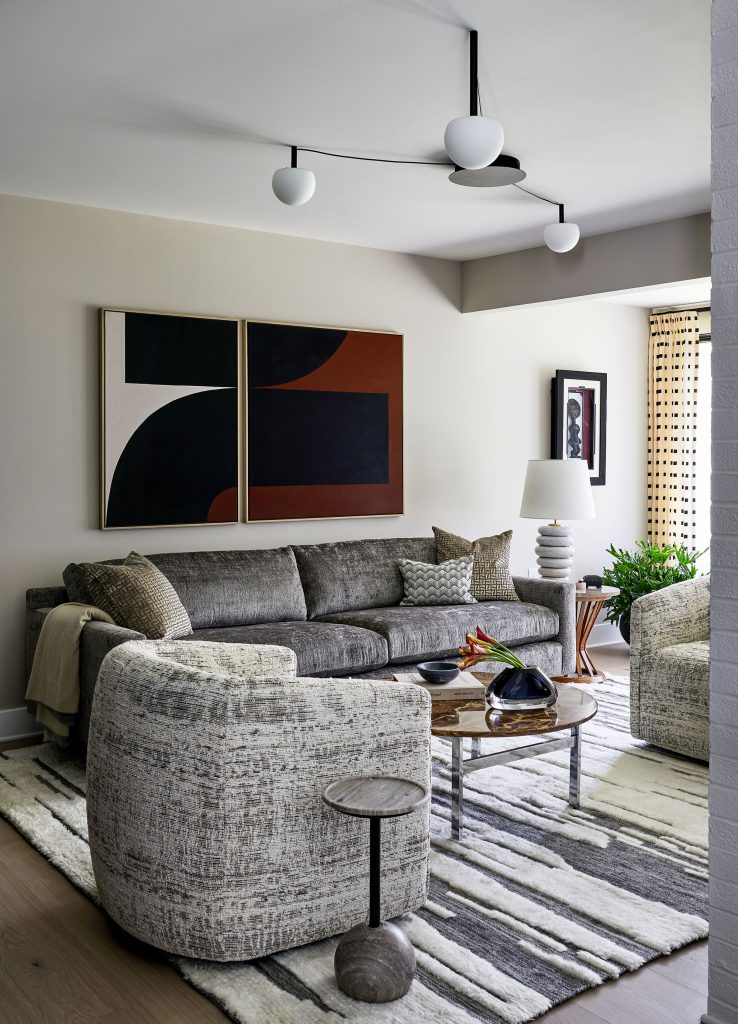
Living Room:
Sectional – Mitchell Gold; Fabric: Schumacher
Swivel Chair – Mitchell Gold; Fabric: Pierre Frey
Ottoman – Bernhardt; Fabric: Hines
Rug – Floors Etc.
Side Table – Arteriors
Table Lamp – Visual Comfort & Co.
Light Fixture – Regina Andrew
Millwork – Lyndon Heath Cabinetry
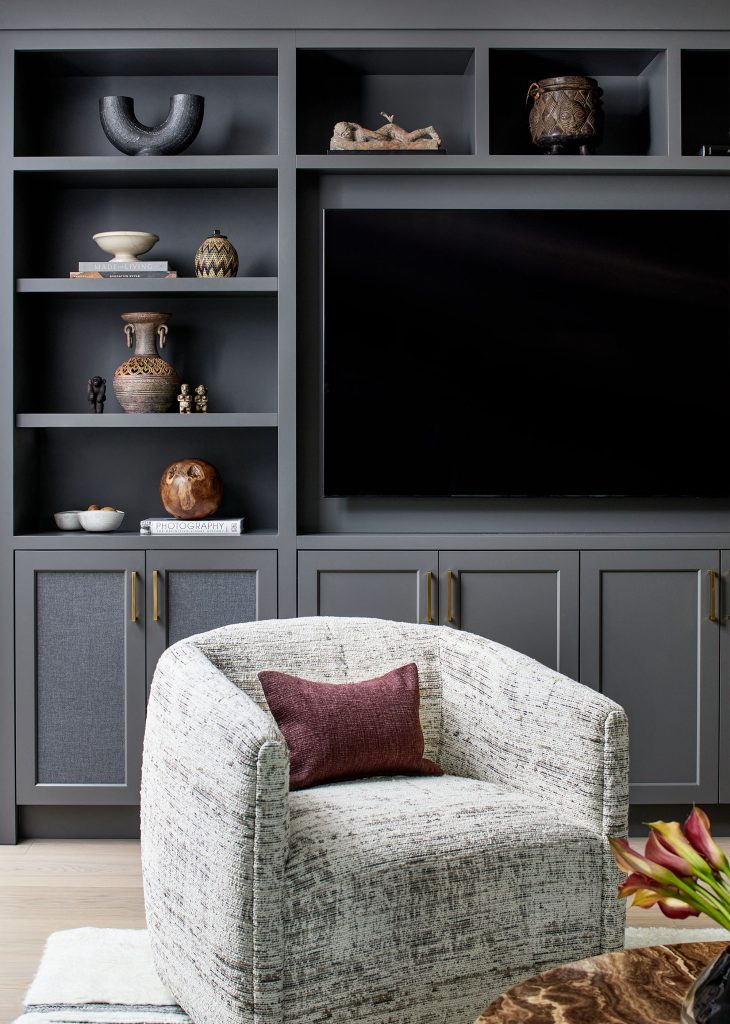
Den:
Sofa – Mitchell Gold; Fabric: Osborne & Little
Sofa Pillow Fabric – Holly Hunt
Chairs – Bernhardt; Fabric: Cowtan & Tout
Rug – RH
Light – Lumens
Millwork – Lyndon Heath Cabinetry
Window Treatment – Grand York, Fabric: Kravet Window
Art over Sofa – Artist Jeroen Broux Art
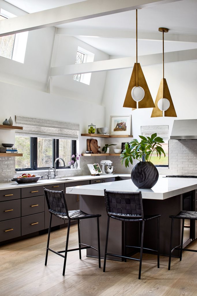
Kitchen:
Countertop – Rock Tops
Millwork – Bath Kitchen & Tile
Counter Stools – CB2
Pendant Lights – Visual Comfort & Co.
© Annapolis Home Magazine
Vol. 14, No. 5 2023