- © 2026 Annapolis Home Magazine
- All Rights Reserved
by Kymberly Taylor
Photography by Stacy Zarin Goldberg
When a couple with a young family purchased a 8,110-square-foot home in a D.C. suburb, they felt the space was overly formal with erratic appointments, including angels frolicking on the bathroom ceiling, a mosaic fountain in the great room, and ornate gold escutcheons. “It was a little ‘Hugh Hefner’” is one way of putting it, according to VW of Fowlkes Studio, a D.C.-based firm specializing in architecture and interiors. He and his partner Catherine Fowlkes freshened up and lightened all 14 rooms in the house, revising it from top to bottom. Built in 1925, many misguided renovations over the years had confused its identity. “It was nondescript… it did not know what kind of house it was. It was a little schizophrenic, and we got it under control,” explains Catherine.
Because the owners wanted to honor some of the home’s traditional elements, the architects did not gut the interior. Rather, their approach was more surgical, explains VW. Among other things, they reconfigured the floor plan, changed the sizes of the rooms, added millwork, and replaced all the windows and most of the light fixtures. They selected artistic custom furnishings and window treatments meant to counterbalance the home’s more traditional dark floors and crown molding. They also gave it the character the homeowners desired. “In reality, we were taking something that felt almost too stuffy and infusing it with a little bit more soul and patina,” explains Catherine.
The main issue they faced was circulation. Put simply, the floor plan was muddled and lacked hierarchy and cohesion. “There is an intuitive way of understanding public and private spaces in a home. Sometimes you know where to go. Sometimes you feel a little bit unmoored, and this was an example of that. You went through a room that didn’t make sense to another room rather than understanding how you could potentially circulate in a more intuitive way,” says Catherine.
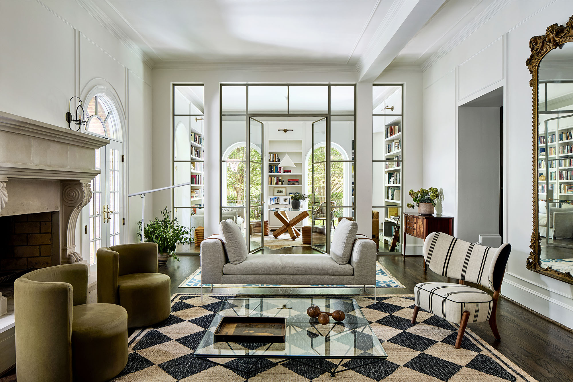
For example, on the first floor, one long dark giant room in the back spanned the width of the house without a clear purpose. They installed a custom glass-and-steel partition about a third of the way through and added arched windows, creating one of the home’s most poignant spaces: a living room with a grand fireplace and adjoining library with elegant light fixtures, custom shelving, and crisp white walls. “Now this room is laid out in a symmetrical manner around the fireplace. It had been so large that it was hard to furnish and hard
to occupy,” notes VW. To further lighten the space, they chose eclectic furnishings conducive to game nights and relaxation.
The kitchen, once dingy and cramped, received a makeover, including pale pink cabinetry painted in a shade called Dusty Trail by Benjamin Moore.“It’s a blend of new and old,” notes Catherine. In a significant move, the team merged the kitchen with the adjacent hallway and original dining room, creating one large eat-in kitchen. The informal dining area has a round table, spindle dining chairs by Four Hands, and a pendant by Hay. A reclaimed black-and-white marble floor is meant to look as if it had always been there. Behind the kitchen is a handy mudroom accessed by a frosted sliding glass door.
In the dining room, they replaced the fireplace mantel with one from D.C. Mantels and added sconces to give it “the heft it needed.” Some walls are covered in blue patterned wallpaper by Mind the Gap, and others painted Hague Blue by Farrow and Ball. Hanging over the fireplace is one of the client’s art pieces, creating a “maximalist moment,” notes Catherine.
A problem area was a dark adjunct space located behind the homeowner’s office. The team repurposed this into a kid’s room inspired by the nursery in Peter Pan. It may be the charming window seat, giant antique library table, and painted brick fireplace, but rather than experiencing zenosyne—the sense that time keeps getting faster—one feels that the world has slowed down for the children and settled into place.
The master bedroom has soothing earth tones accentuated by smoky blue paint called De Nimes by Farrow and Ball. In the primary bath, the Sistine Chapel-inspired winged putti on the ceiling have been replaced by new millwork that “feels fresher and cleaner.” Updates include a bleached walnut and tile counter, new lighting, and a rug found on First Dibs. A terrace with impermeable paving, a whimsical railing designed by Fowlkes Studio, and comfortable furnishings replace a plain pre-existing balcony with an iron balustrade.
Now that the home is finished, VW reflects that every surface has been “touched.” Clarity has replaced confusion, and the homeowners have defined spaces conducive to family life. With all the devotion this once “nondescript” home has received, the word “space” seems reductive. This family residence is more like a vessel containing sacred, mindful objects or an ancient illustrated storybook opened mid-way, with pages left to fill.
Architecture & Interior Design: Fowlkes Studio


© Annapolis Home Magazine
Vol. 17, No. 1 2026